Leaderboard

Popular Content
Showing content with the highest reputation on 04/11/2015 in all areas
-
I'm not sure if it's been mentioned in the main thread (and 48 pages is a bit much to look through), but I just noticed that the font used to write Green Day on the HOB poster is the same as they used on Kerplunk; that probably means nothing but I like details.3 points
-
My first drawing of Tré. I love it. ❤️2 points
-
I will give you iconic as well. I don't believe it is the best. My favorite is WICA, I think it flows the best and adds the most to the song, But if you are thinking musically, I would have to think about that.1 point
-
Sassafras Roots?Welcome to Paradise? I feel like something from Insomniac should be here too, but I can't think what.1 point
-
One could almost say you're overplaying its being overplayed.1 point
-
I'm listening to 21CB right now. It's still awesome.1 point
-
Eh She is kinda boring on Dookie now live is a different story1 point
-
He´s leaving early. Does he have to line up?1 point
-
For laly <31 point
-
It took me a while to finally realize that the Trilogy sucked. I have no idea why it took me as long as it did...1 point
-
1 point
-
1 point
-
1 point
-
1 point
-
1 point
-
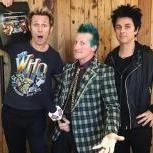
He was SOOOOOOO cute at the NAMM event :wub:1 point